[vc_row][vc_column][vc_column_text]What do you do when the boss says “I have all this Excel data but I don’t know what it means”? Presenting your data in an organized way is critical to spot trends and to make projections.
We all know that visualizing data is the key to an effective presentation. There are many tools like Tableau that can visualize your data, but to do that means another investment in a new platform that we have to learn. What if we told you that you may not need a data visualization tool like Tableau to visualize your data? What if we told you that you can visualize your data with Excel?
Well, we are here to tell you that you can. Excel has a great feature called PivotTable that lets you summarize data in meaningful groups. It gives you control of your data so that you can make predictions and analyze trends. We wrote a blog that gives you a step-by-step tutorial on PivotTables. If you are unfamiliar with Pivot Tables, we suggest you take a moment and read through that tutorial.
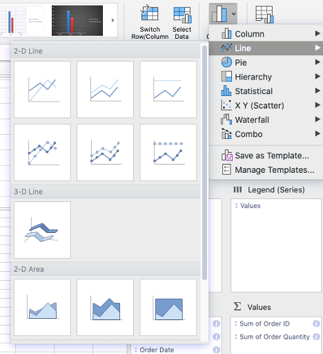
PivotTables is just the icing on the cake. Excel also has a feature called PivotChart that gives you more control over the visualization of your data. Charts include statistical, line, pie, waterfall, among other chart types.
We are going to walk you through the basics of PivotChart.
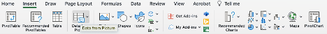
Start by opening your Excel file that has the PivotTable. You can click on the Insert tab and select the PivotChart option.
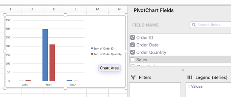
When your PivotChart opens in the work area, you can choose the fields of your data that you would like to show in the chart.
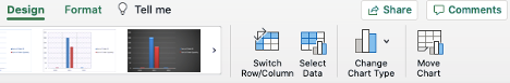
The beautiful thing about PivotChart is that you are not restricted to one type of chart. Depending on the data, you can choose other chart types by going to the Design tab and selecting Change Chart Type. Here, you can select the chart that will make the most visual impact.
Now you can share your data visualization and help your viewers whether they be C-level executives, board members, or your sales team see a better picture of what you are trying to convey.
We know that understanding and using features in Excel like PivotTable and PivotChart is beneficial to your organization. It can help you organize your data, minimize confusion, and make informed decisions. This is why we offer customized online corporate training in Excel and other Office365 apps because we know it is important that your staff has the knowledge of the software and uses it productively and consistently. If you are interested in Excel training for your company, please contact us. We would love to talk to you.